GPT Image 2 Prompting: 7 Habits That Actually Move the Needle
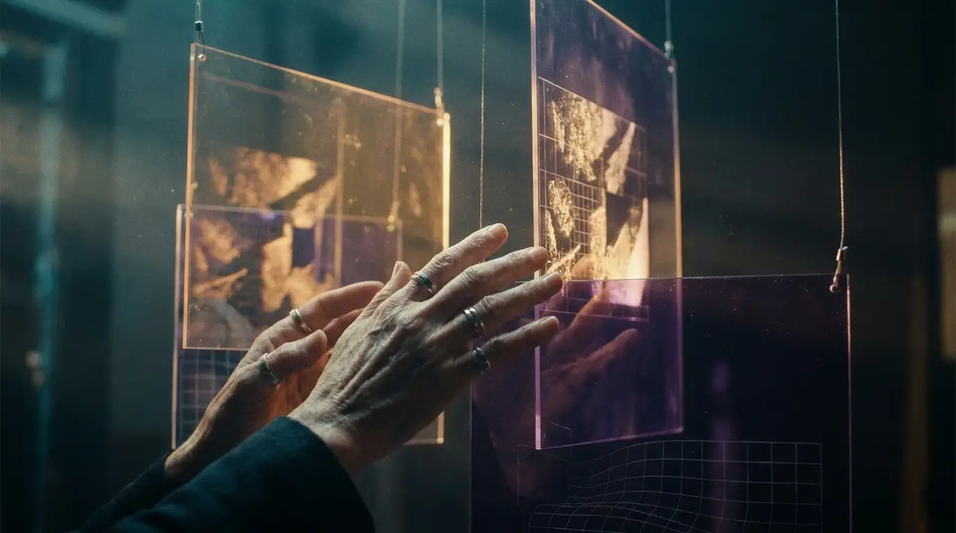
GPT Image 2 Prompting: 7 Habits That Actually Move the Needle
GPT Image 2 has been live for about two weeks now, and the prompting playbook we built up over the last year of GPT Image 1 and 1.5 doesn't quite carry over. The new model thinks before it draws — which means the prompts that used to feel clever now feel noisy, and the prompts we used to throw away as "too plain" are suddenly the ones that ship. We've spent the last fortnight stress-testing it across product shots, editorial covers, panel art, and 2K wallpapers, and a clear pattern has emerged.
This post is about the GPT Image 2 prompting habits that have actually shifted our outputs from "fine" to "use this one." If you're still copy-pasting your old GPT Image 1 prompts into the new endpoint, you're leaving most of the upgrade on the table.
What changed under the hood (the short version)
OpenAI shipped gpt-image-2 on April 21, with O-series reasoning baked into the image pipeline. The model now researches, plans, and self-checks before rendering a single pixel. There are two access modes — Instant for fast generations and Thinking for the slower, multi-step path that can return up to eight coherent panels in a single call, with consistent characters and brand colors. Native resolution goes up to 2K. Text rendering, the old Achilles heel, is now near-perfect across multiple languages.
That capability shift is why prompting habits have to change. When the model has the budget to reason, the value of telling it what to think about outweighs the value of stuffing it with adjectives.
Pro tip: If you find yourself piling on more than ~80 words of style descriptors, you're probably writing for GPT Image 1, not for GPT Image 2.
1. Lead with intent, not aesthetics
The biggest unlock for us has been writing the purpose of the image first, before any visual descriptors. Something like "A hero image for a Series A fintech landing page targeting US SMB owners" gives the model a north star. It then makes its own choices about composition, color, and subject in service of that intent — and those choices tend to be sharper than ours.
Think of it less as commissioning a render and more as briefing a senior art director. The brief leads, the visuals follow.
2. Spell out the text you want — don't summarize it
Text rendering is where GPT Image 2 separates itself most from the pack. But the model gets dramatically better when you give it the exact characters, not a description.
- Bad: "Has a pricing label saying it costs nine ninety-nine"
- Good: "Pricing label reads exactly:
$9.99/mo"
We've been quoting strings inside backticks or curly quotes to make the boundary unambiguous, and it almost always renders the literal string back. For posters, packaging, ad creative, and UI mockups this single habit has cut our re-roll rate in half.
3. Pick one style anchor, named precisely
Old habit: stack five style adjectives and hope something sticks. New habit: pick one named visual reference and let the model interpret it.
Compare:
- "Cinematic, moody, dramatic, painterly, atmospheric, editorial-style, magazine cover-grade"
- "Shot on Kodak Portra 400, magazine editorial cover, late golden hour"
The second prompt is shorter, more specific, and gives GPT Image 2 something concrete to plan against. The first is just vibes — and the new model is good enough at vibes that piling them on usually drags the output toward the average.
Other style anchors we keep in rotation: criterion-collection still, Annie Leibovitz Vanity Fair portrait, 1990s Ridley Scott commercial frame, risograph print, Apple keynote product shot.
4. Use Thinking mode for sets, Instant mode for one-offs
This is the rule we wish someone had told us on day one. Instant mode is a spectacular replacement for GPT Image 1.5 — fast, cheap, free-tier accessible, great for single hero images and quick comps. Thinking mode is something genuinely new. Use it when you need:
- A character that has to look the same across 4–8 frames.
- A storyboard, comic page, or carousel.
- A product set where SKUs have to stay visually consistent.
- A brand system where palette and type have to lock across every output.
Asking Instant mode to do those jobs will frustrate you. Asking Thinking mode to do a single throwaway thumbnail wastes credits and tokens.
5. Move from "describe" to "constrain"
GPT Image 2's reasoning means it's much more obedient to negative and positive constraints than its predecessors. Rather than describing an entire scene, we now write a short positive description and then list the constraints that matter:
`` Subject: a barista at a wooden counter Style: 35mm photo, natural daylight Aspect ratio: 16:9 Must include: a single ceramic V60 dripper, no espresso machine Must avoid: any text, any visible logos, any lens flares Tone: quiet, observational, no smiling ``
Treating the prompt like a spec sheet rather than a paragraph has turned out to be the single most reliable way we've found to get the same image twice.
6. Iterate conversationally — don't restart
This one is genuinely fun. Because GPT Image 2 supports surgical multi-turn editing, you can ask follow-ups in plain English: "Same image, but the dripper is glass not ceramic and the lighting is one stop darker." The model preserves what you didn't change. No more rewriting the whole prompt every time you want to nudge a single element.
The mental shift is to stop thinking of each prompt as a one-shot and start thinking of a generation as a conversation that branches. If you've used Claude or ChatGPT to refactor code one chunk at a time, you already know the rhythm.
7. Give the model an aspect ratio early — and mean it
16:9, 1:1, 9:16, 4:5 — pick one and put it near the top of the prompt, not buried at the end. The reasoning step uses aspect ratio to plan composition, so telling it late means it has to course-correct mid-render. We saw a noticeable drop in awkward cropping the moment we started declaring AR in the first sentence rather than the last.
For platform-specific work, we lock these defaults: 9:16 for Reels and Shorts, 1:1 for grid posts, 16:9 for video thumbnails and blog headers, 4:5 for in-feed Instagram carousels.
Putting it together: a prompt template we actually use
Here's the skeleton we copy into a new doc whenever we start a brief. Fill in the blanks, paste the result, ship.
`` INTENT: <what this image is for, who it's aimed at> SUBJECT: <one sentence, no adjectives yet> STYLE ANCHOR: <one named reference: film stock, photographer, era, format> COMPOSITION: <framing, focal length, point of view> LIGHT & PALETTE: <natural / studio / mixed; 2-3 colors max> TEXT TO RENDER (exact): <literal string or "none"> ASPECT RATIO: <e.g. 16:9> MUST AVOID: <text, watermarks, common failure modes> ``
It looks dry, but dry is the point. GPT Image 2 prompting rewards clarity over cleverness, and structure over sprawl.
Where this leaves us
If we had to summarize the GPT Image 2 prompting shift in one line, it would be: stop performing for the model, start briefing it. The new reasoning layer is doing work the old model couldn't, and it's most useful when we leave room for it to think instead of trying to dictate every pixel.
We'll be testing the same habits against nano_banana_2, seedream_v4_5, and flux_kontext over the next couple of weeks to see how transferable they are — early signal is that the intent-led and constraint-style prompting carries over surprisingly well, while the named-style-anchor trick is more model-specific. If you've found a habit that's been moving the needle for you, we want to hear about it.
For now: shorter prompts, sharper intents, exact strings, one style anchor, and Thinking mode when you actually need it. That's the GPT Image 2 prompting toolkit we're keeping on our desk.